If you’ve ever wondered what you should do about your homepage, the most important aspect of your website, there are some common practices that you need to follow to give your users a good experience when they browse your site.
There are two schools of thought when you’re deciding how to build your site. The first is that you optimize your homepage for one specific keyword. The other is to simply create a site that showcases what you’re about and how people can most easily find the products, information, or services they need. However, we feel like there’s no reason you need to choose between these. You can accomplish everything on this list in an effective and meaningful way for your business. You just need to concentrate on a few elements.
What is your website about?
This is a good place to start and a question you need to answer immediately, either through visuals or through words.
Keyword Strategy
Depending on what your business does, you should start by answering the following questions when someone lands on your homepage.
- What is your main product or service?
- What can be found on your products and on your company itself on the website?
- What is the main benefit the visitor?
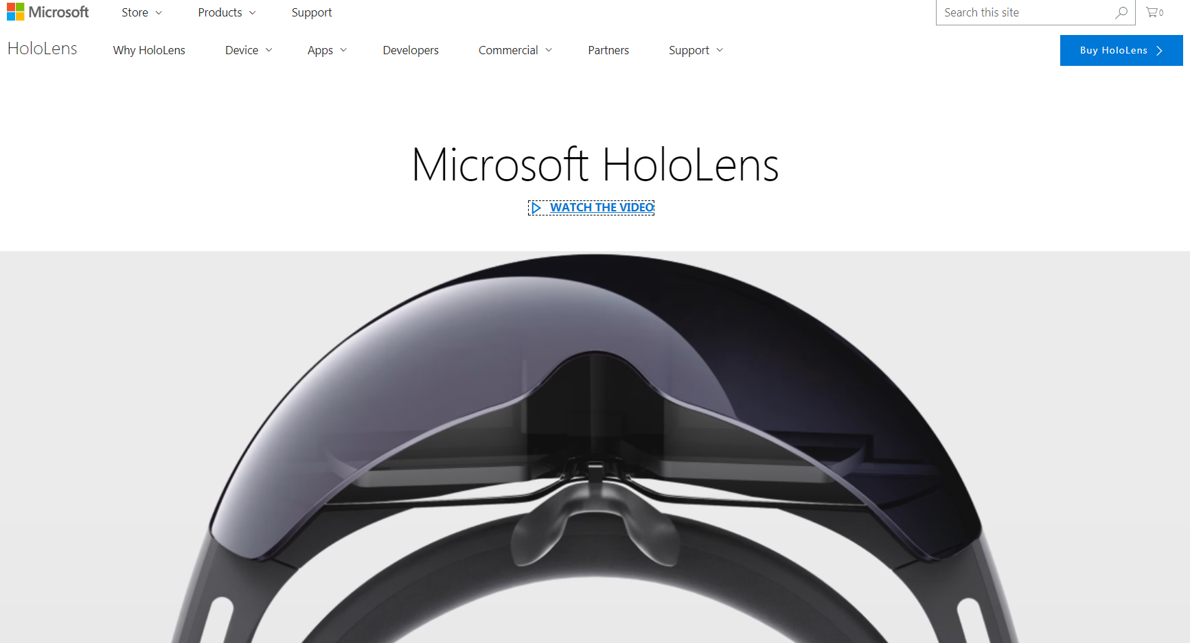
At the end of the day, no matter what you sell, the customer should know what makes your store unique and why they should choose you over the competition. Let’s use an example to make things a little easier. Microsoft released a new bit of technology for augmented reality known as the HoloLens. If you don’t know much about what it does how it works, you could easily get lost by their product page. However, being the pros that they are, Microsoft makes it simple to learn what this machine does and how you can buy one.
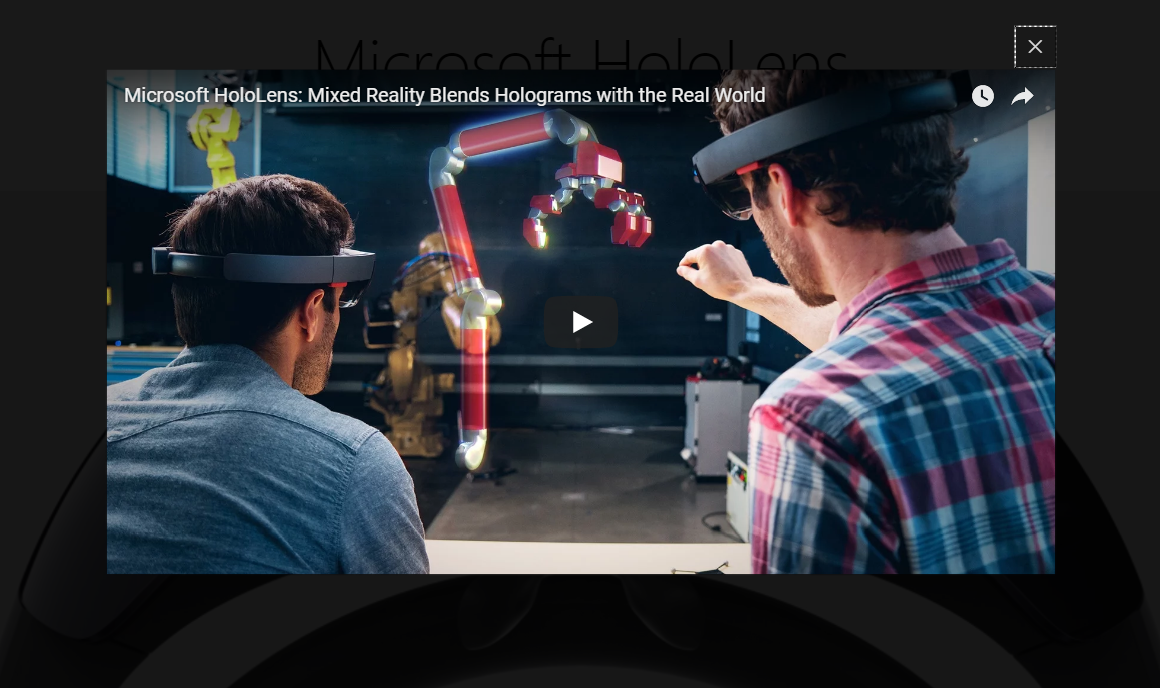
When you land, you get a crisp image of the product and an immediate prompt to watch a video that explains everything you need to know. When you follow this link, a pop-up window displays to show you the video so you don’t even navigate away from the page. You might also notice the button that allows you to buy the product in the top right corner, but no emphasis is placed there because they want you to learn more first.
After watching the video, you can scroll down a little more to see a prompt button that takes you to the purchasing page. Below that are even more videos and statistics for the more curious shopper, but the intent is to answer every question in the video and have people that want it but the product. Short, simple, and clean.
Our only tweak would be to have a short excerpt at the top between the title and the video link that explains in a sentence what the product does.
The end result should be crisp imagery and wording that tells people exactly what you’re about.
Guide Your Visitor
The main focus of your homepage should be to guide visitors through the different pages of the site, pretty simple. So, it should follow, you need to create the perfect system in which someone lands on your site, sees what you’re about as a business, and can easily find what they need from there.
Optimizing Your Homepage: Menu
The easiest way to accomplish this goal is to design the menu. Let’s go back to the HoloLens example to get a better idea of what I mean.
This menu answers some much-desired questions about the product. Who developed it? What apps are available? What devices do I need for this thing to work? Is there a support staff I can talk to if I have a more in-depth question? These are all clearly addressed and answered in the menu, leaving the home page to simply talk about the product itself and what you can do with it, using videos and crisp images.
Here are the main points to focus on for your main homepage menu:
- Be clear
- Minimize Products with General Categories
- Search
- Contact Page at the End of the Menu
- Do not Clutter the Menu (Essential Only)
Optimizing Your Homepage: Conclusion
Your homepage should make the intent of your business clear and give your visitors the chance to find everything they want from your site with maximum ease. With that in mind, it’s best to pretend you’re a customer looking for your business’s industry. From the homepage, try to find one product, service, or piece of information and note any difficulties you may have. If you’re too biased, get a friend with no knowledge of the site and tell them to find something specific. If they are struggling, odds are someone else will as well.
