Have you come to question the structure of your website? Maybe you started out with a simple design, but now you continue to stumble on pages you forgot you had. This is not only bad for you, but it’s bad for SEO too.
It might be time to roll up your sleeves and fix the structure of your site.
At WebCroppers, we know the struggle all too well. That’s why we’ve put together a few tips to help you analyze the problem and start fixing your structure step-by-step.
Your Site Menu
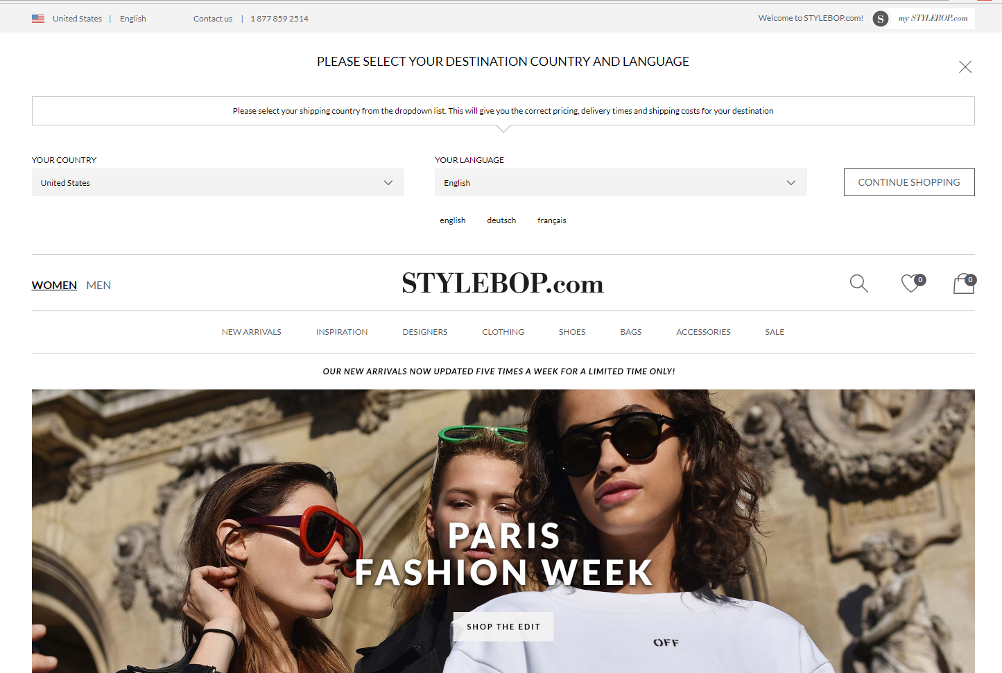
To many people, this is the first and last line of structure building. From this header section, people can get to any page on your site with just a few clicks of their mouse. Now, there are a few exceptions, but we’ll get to that later. For now, just know that the goal of your main menu is to be concise and focused. Take a look at the example below.
This example comes from a pretty popular fashion store, Stylebop.com. Now, there are a few things they do right and a few things that could be improved. Note that the items you put in your main menu are what you’re telling people are the most important aspects of your site. You’re also telling search engines that all the items on this menu are equally relevant to your website.
Some people don’t understand this and will add menu items that aren’t relevant. For example, having sale items that you don’t usually have to spark short-term sales. However, in the long-run that hurts you.
Let’s take a closer look at what their menu items are:
First, you can choose between men’s or women’s clothing, which is great for people that don’t want to sift through a bunch of sub-menu items to find clothes for their gender.
The main categories are New Arrivals, Inspiration, Designers, Clothing, Shoes, Accessories, Bags, and Sales.
Although they have thousands of items featured on the site, they start their customers on a journey to narrow everything down. We refer to this as an SEO funnel and it seems to work.
There are only two items of importance on this list that might get other stores into trouble. Essentially, the website is saying both their Inspiration and their Designers are as important as the clothes they sell. For most clothing stores, this isn’t true.
Take target for example. While people love their prices, they don’t much care for the brands behind them. Thus, their website negates the ability to choose between their various brands because they’re irrelevant to customers. Instead, Target takes their menu to the extreme, forcing users to go through a funnel or search for exactly what they want.
Now, let’s go through Target’s funnel. You start with the main categories drop-down (seen on the homepage).
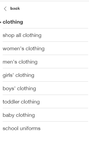
Next, we will choose a large category like “Clothing.”
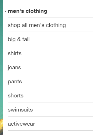
Now, we can select the gender to narrow it down even further.
Let’s say we want to shop for some new shirts.
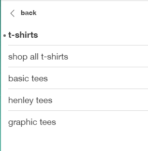
Specifically, we want to choose some cheap t-shirts.
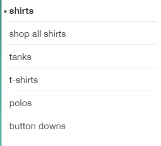
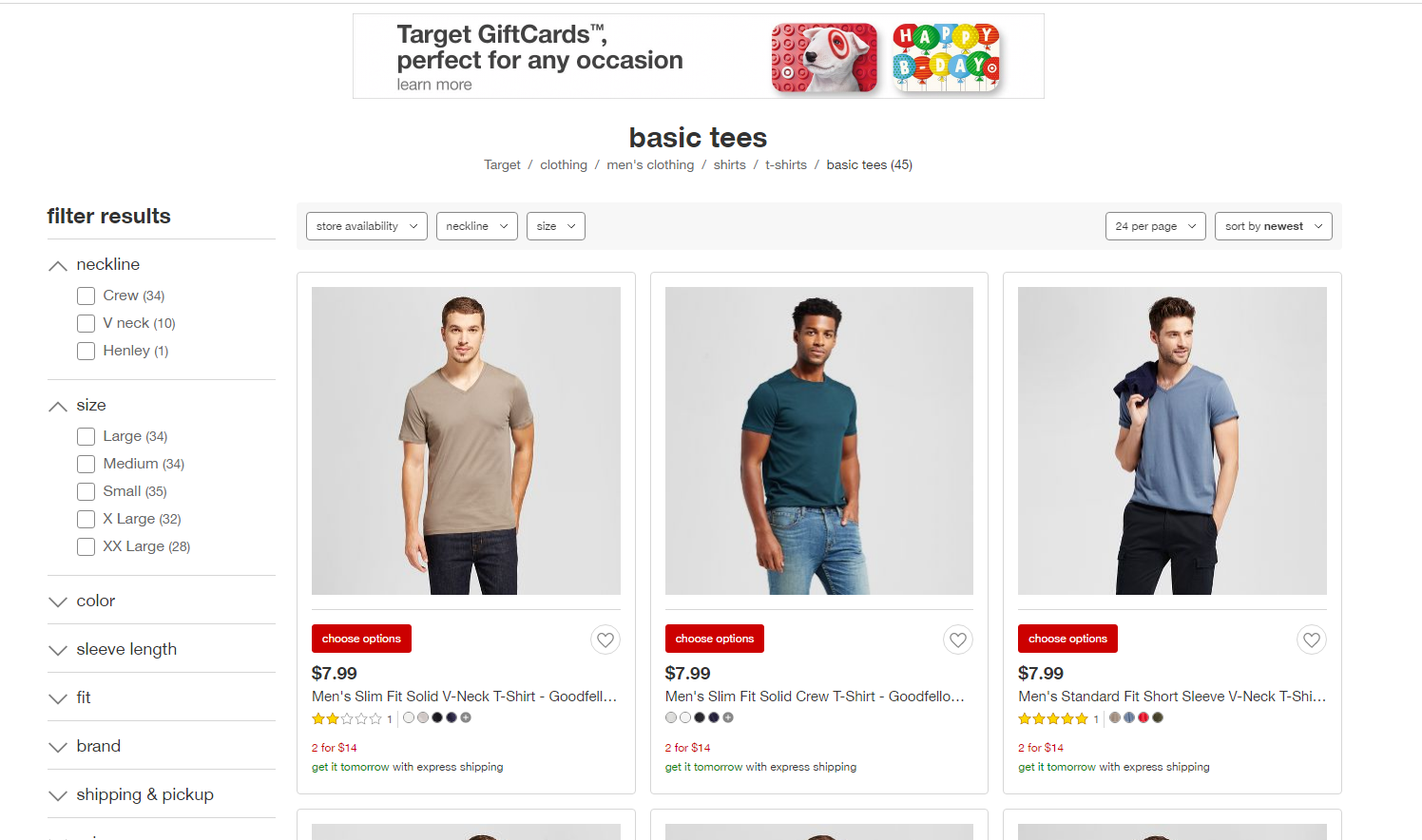
Once that’s selected, Target finally gives us some options to look at.
I went through 5 filters (different than levels) before even coming to a product. With Stylebop, you’re taken to a new page and you can funnel your shopping with the filters on that page.
This raises the question, which way is better? While both adhere to the modern style, they are pretty different.
How many levels?
You may not be familiar with the term, but when you go to a site, the number of levels it has can make or break the user experience. Imagine, going to the “Clothes” category of a site and it takes you to a page for clothes. That’s one level. On that new page, you see multiple categories, you click on “Socks.” That’s the second level. On this most recent page, you see different materials, you choose “Cotton.” That’s the third level. On this new, new page, you find categories for color, you choose “Green.” On this current page, you see more options for different shades of green and on and on and on.
Do any sites do this? No, they simply use filters. At some point that process becomes tedious and they leave it to a side-menu with filter options that the user can select all at once. The goal is to have as few levels as possible to start with, then leave the rest to your users and your filters.
Going back to our Stylebop example, you can see that they have 2-3 levels before they give their users the option to use filters to select what they want.
Target relies completely on filters. At most, you want 3-4 levels for your site; having tedious options that go deeper and deeper into your site, like the “Sock” example above, gives your users a bad experience.
As for which way is better, it really depends. While Target maintains fewer levels, their site is ultimately slower because every page must contain those filters. It’s somewhat of a trade-off.
Home and Contact
Now, let’s look at your home and contact page. These are two facets of a website that we’ve all come to expect. When you go too far from where you started, it’s nice to know you can start over again. Likewise, if you have a problem or you want to place an order, it’s nice to know that you can find the number and contact information with a simple click.
We recommend having the home menu as the first item on your menu. Next, should be all the main categories of your site. Finally, your contact page should be the last menu item. This way, you follow a chain that makes sense to the user. Your starting goal is to get them to the page, then they search everything they’re interested. Finally, they contact you. This is something even we employ on our site.
Relevant Menu Items
Okay, that’s all well and good, but what’s relevant for my site? What should I put and what should I leave out?
We like to ask ourselves a few questions to solve this problem. First, “What is my site about?” and “What will users come here for?” Styebop is high-end fashion so what’s relevant for them is their clothing and the high-end designers behind them, like Valentino. They emphasize the designer’s latest styles with a “New Arrivals” category. They also allow people to choose the designers they want, the clothing items they’re looking for, then separating radically different items into their categories, like shoes, accessories, bags, and their sale items.
The only thing that becomes erroneous is the “Inspiration” category. This might be important to the brand but seems ill-placed among their most important items that they’re trying to rank for.
Optimizing Your Site Structure
We’ve talked about the main menu, but now you want to know if links should be anywhere else. The answer is most certainly. Let’s say an article talks about a specific subject, yet you want to know more details about a topic that the article just glances over.
Now, let’s say you wrote that article and you have another article that is about that one vague topic.
Would it be easier for the user to link that other topic in the text or make the user go back to your menu and try to find it through there? Obviously, a simple link would be easiest.
The idea is simple. Imagine Wikipedia. They link relevant terms in every single article. This is something you should actively try to aim for.
We try to do this on our category pages as well. Some of the services we offer as a marketing company may not be apparent to the user. In these instances, we link the first mention of the word to blog articles that tell our users what they are.
Bottom line, it’s convenient and user-friendly. Try to incorporate this as much as possible.
Draw it Out
One thing that we find helps is to draw out the structure. Use a whiteboard so you can draw and erase as you change the structure.
You’ll start with a one or two level menu. If you have products, see where you can have the users take over with filters. Next, start linking relevant terms in the text to your other pages. In this way, you have an intricate spider web that contains all your pages. Everything is connected in some way or another. On the other side, you have a simple structure for users to follow and find what they need.
SEO Site Structure Conclusion
Your website should be like a living, breathing organism, everything should be connected. However, you want to structure the site in a way that makes this connectivity, simple and user-friendly. We recommend having a maximum of 3-4 levels, shoot for 2, and trim your main menu down to items that are essential. In other words, items you want to rank for on search engines.
The next step is to go through your existing content and incorporate links that take users to relevant pages in the text of your content.
This should give your users a comprehensive experience.
