You might have wondered why some content does better than others. Let’s say you’re comparing product descriptions with a blog. Perhaps they even talk about the same product. Which one do you think does better in a competition for rank?
The blog!
But why is that the case? Well, it typically has to do with the reader and their impressions of the page after landing. When you land on a product page, you don’t bother much with the details. If you want the product you’ll stay and interact with the page, if not, then you leave.
This behavior is a determining factor in rank. On the other hand, if you land on a blog about the product, you’re engaging with the content. The writer is speaking directly to YOU! Now that’s exciting. They even provide you with a link after describing the product in a relatable way. Isn’t that nice?
Even though the reader has to perform an extra step to buy the product, they’re unencumbered by the fact.
Blog posts rank higher on average than any other format. This fact might be exciting if you’re a blogger but painful if you own an ecommerce store.
Now, what’s the lesson you should take away from this?
You might think using a different format for your product pages would benefit you. Should you hire a blogger? Well, hold off on that thought for a second.
First ask what the reader wants. Is their intent to buy immediately? Do they want to research first? What does your audience typically do before, after, and during their sessions with you?
Something research-intensive material could be buying a wedding ring from your site. They’ll browse prices all around and search additional information. In this instance, a blog-like format could work for your product page.
Starting off with a sentence like “Did you know that spending 3-months’ salary on a wedding ring is a common myth? The average person spends closer to a month’s salary on a ring.” Instead of mindlessly describing the materials of a product, I peak interest with a statistic then I lead them into the content.
One example is the site DudeIWantThat.com. Take a look at their product description for a small drone helicopter.
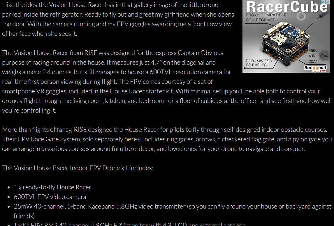
Someone would have to make a 200 dollar investment, which is relatively large for a commodity like this. They approached the description like a blog. The page starts by describing a fun scenario of “couple hijinks” then leads to a short description of how well the product works.
Finally, they list the factory details at the bottom is a short bulleted list. Normally, people would write those bullet points as full sentences and they would immediately be ignored by the reader. Formatting the content this way helps engage with your audience.
Shifting focus to simple purchases, writing a blog about a 5 dollar pencil case doesn’t make too much sense. You’re spending valuable time on something of little consequence.
Instead, look at what Amazon does for this $10 can of magnetic putty. A fun toy but it doesn’t require a blog. Instead, Amazon relies more on the imagery for these products and only gives the factory details in a bulleted list.
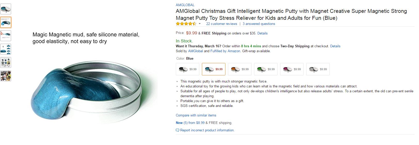
This saves you time, money, and brain power for more important things. People instantly understand the product from the images and get all the information they need. If they want to check to see if the material is non-toxic for their kids, they can do so in the list below. Otherwise, they would have to sift through a boring paragraph and have more time to decide they don’t need this product.
Conclusion
What you need to take away from this article is format and reader intent. Design the format of your article around reader intent. For small items, it might be better to rely on vivid imagery and save time. For those big-ticket items, take the time to compose something engaging for your audience.
